刷新 Case Study
ADHD Coach Website Upgrade
A quick redesign of the website of an ADHD career coach for women academics and professionals. Every line of her copy stays, word for word. What changes is how it reads: clearer sections, a typeface built for legibility, her coaching journey up front, and a calm mode for visitors who find motion distracting.
The brief
The coach asked for two things: stay with her brand colours, and keep the words on her website. So that’s what we did.
She loved the result and bought the site.
The client’s name, photo and email are blurred.
1,730sentences kept word for word
AstroTailwind CSSAccessibilityCalm mode



What changed across the site
- Her colours, her words. Her own magenta, navy and lavender throughout. All 15 pages carried over, and a script checked every sentence against the original: 1,730 of 1,730 match.
- Easier to read. Headings in Bricolage Grotesque and body text in Atkinson Hyperlegible, a typeface designed for legibility, replacing Helvetica and Arial.
- Calm mode. One switch in the navigation turns motion and visual noise down, and the site remembers the choice.
- Clear sections. Every section sits in its own card on a soft grid, with offset “sticker” shadows, in the coach’s own colours.
- Off Squarespace. Rebuilt in Astro and Tailwind CSS.
Section by section
The same eight parts of the homepage, before and after. Click any image to see it larger.
01Header and hero
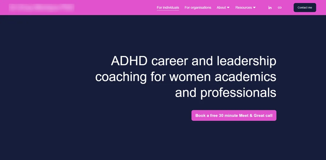
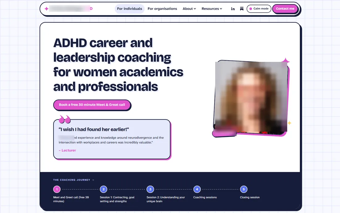
- The navigation becomes a floating bar, with a Calm mode switch next to the contact button.
- Her photo comes into the hero, framed like a sticker with a name tag, so visitors meet the coach first.
- A client quote sits under the button, so proof shows before the first scroll.
- The five-step coaching journey runs along the bottom of the hero.
- The headline moves left and gets a bold, friendly display face instead of Helvetica.
02Introduction
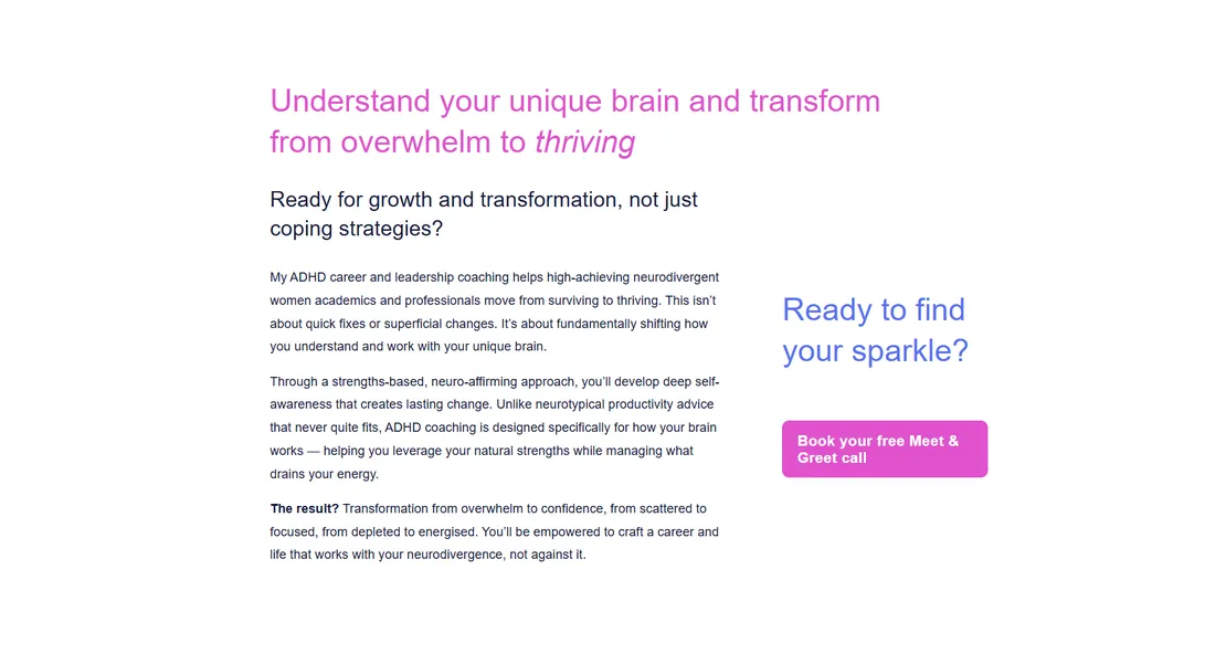
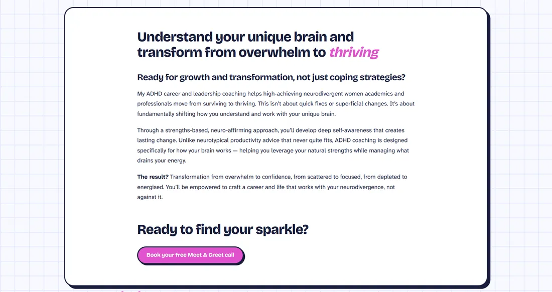
- One readable column in a card, instead of copy squeezed beside a side call to action.
- “Ready to find your sparkle?” now follows the copy, with the booking button right under it.
- The brand word thriving keeps its magenta italic.
03Testimonials
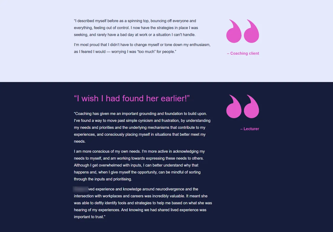
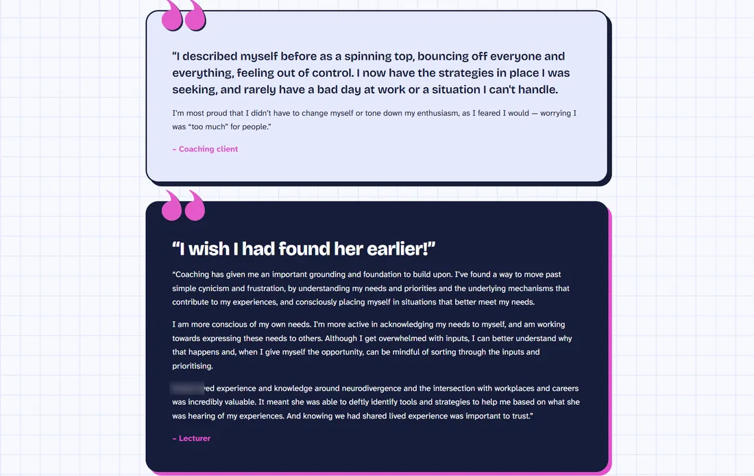
- Each quote becomes its own card, with oversized quote marks and an offset “sticker” shadow.
- The first line of each quote is set large as a pull quote; the rest reads at body size.
- Quote cards sit narrower than the content cards, so they read as asides between sections.
04Coaching process
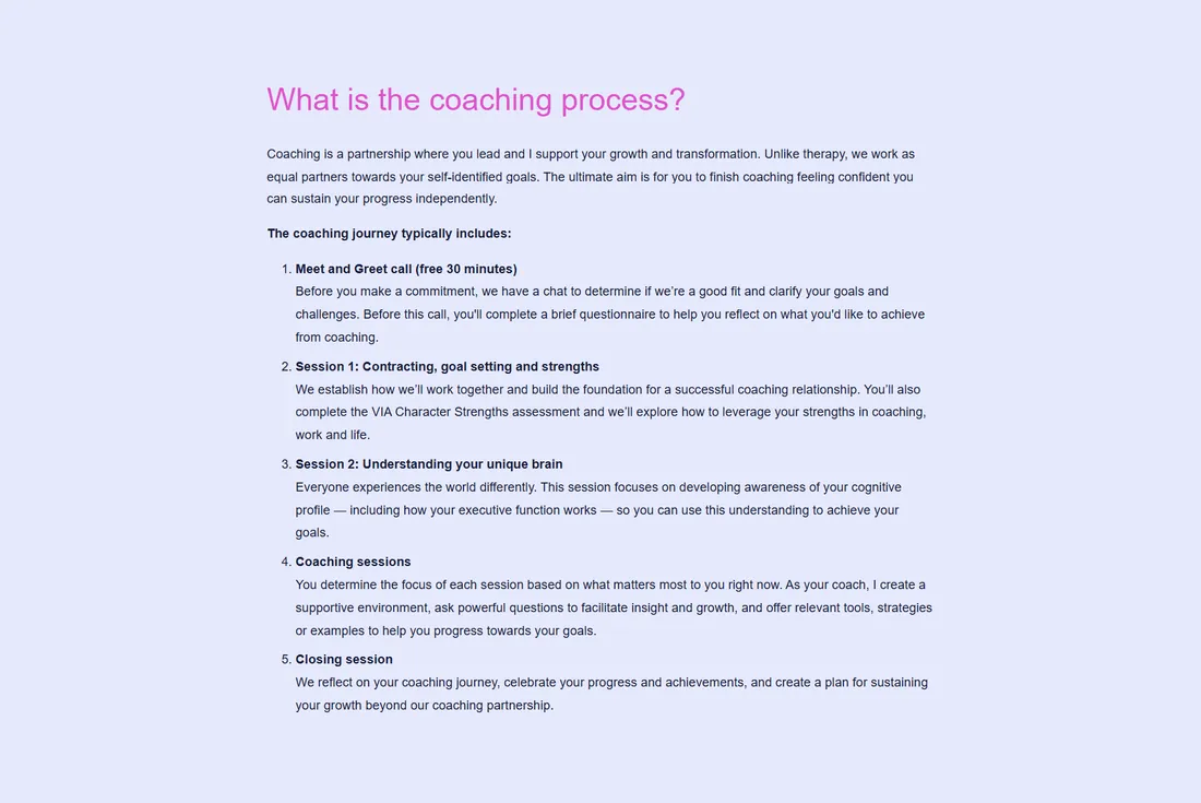
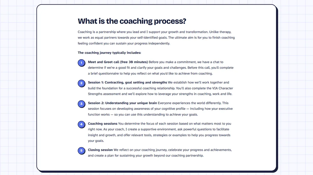
- Steps get numbered circles instead of a plain numbered list.
- Each bold step name leads straight into its description, so the steps scan in seconds.
- The whole process sits in one card, like every other section.
05Coaching packages
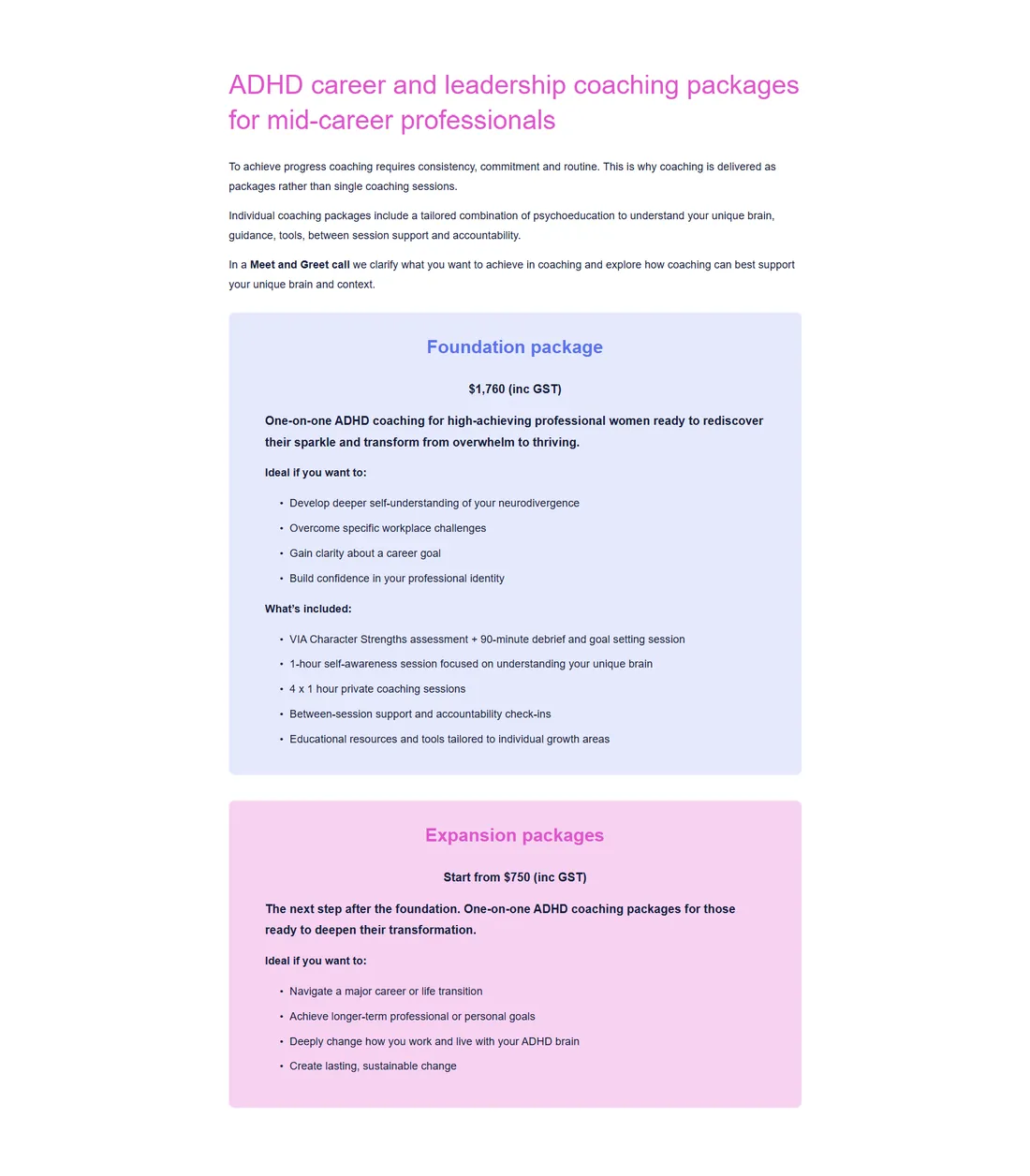
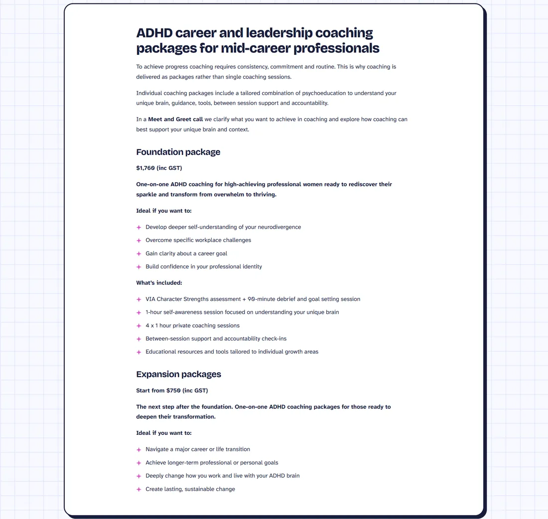
- Both packages sit in one left-aligned card that scans top to bottom, instead of two centred boxes.
- Sparkle bullets replace plain dots and tie the lists to the brand.
- Prices, inclusions and wording are unchanged.
06Contact form
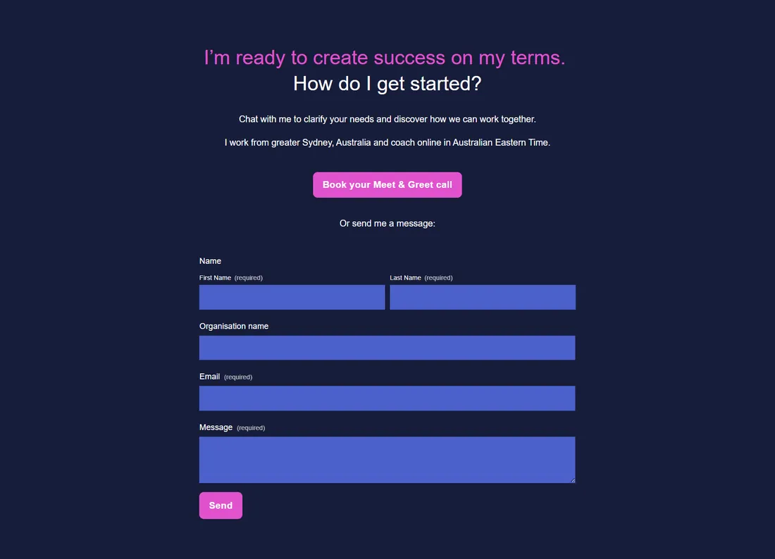
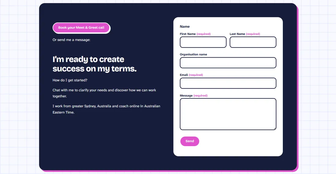
- Two columns: the invitation and booking button on the left, the form on the right.
- A white form with outlined fields replaces blue filled boxes on navy, which were hard to read.
- Required fields are flagged in magenta instead of small grey text.
07FAQ
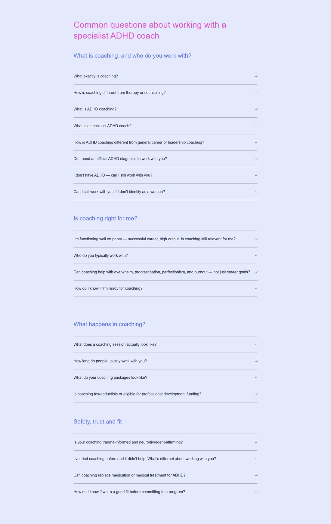
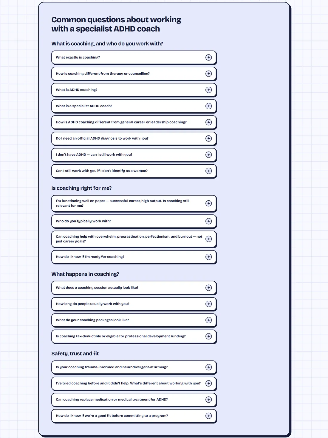
- Questions become rounded buttons with a plus icon, under the same four headings.
- Each one opens on its own, so the page stays short until a visitor needs an answer.
- All 20 questions and answers are kept as they were.
08Credentials and footer
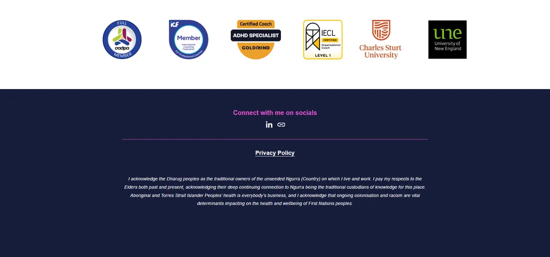
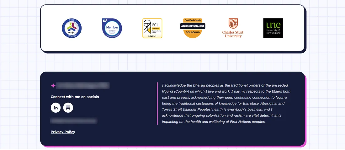
- The credential badges sit in their own card instead of floating on white.
- The footer splits in two: name, socials, email and privacy policy on the left, and the Acknowledgement of Country on the right, set off by a magenta rule.
- The contact email now shows in the footer.